Cursive: Lowercase - Alphabet Animation


 خرید لپ تاپ استوک
آکوستیک ، فوم شانه تخم مرغی ، پنل صداگیر ، یونولیت
دانلود فیلم جدید
خرید فالوور ایرانی
خرید فالوور اینستاگرام
خرید ممبر تلگرام
ماهان سرور
دستگاه جوجه کشی حرفه ای
فروش آنلاین لباس کودک
[ + افزودن آگهی متنی جدید ]
خرید لپ تاپ استوک
آکوستیک ، فوم شانه تخم مرغی ، پنل صداگیر ، یونولیت
دانلود فیلم جدید
خرید فالوور ایرانی
خرید فالوور اینستاگرام
خرید ممبر تلگرام
ماهان سرور
دستگاه جوجه کشی حرفه ای
فروش آنلاین لباس کودک
[ + افزودن آگهی متنی جدید ]


Cursive: Lowercase - Alphabet Animation
IN an ancient Assyrian document, which was written during the reign of Sardanapalus V., it is said that the god Nebo revealed to the ancestors of the King the cuneiform characters of their language. This account of the sacred origin of their writings was universally believed by the people. To many persons, trained in the customs and modes of thought peculiar to our age, it seems quite incredible that this idea was over seriously entertained; but, according to statements of reliable historians, such a belief was universal.
Nearly every nation of antiquity has, at some period of its history, attributed the origin of letters to the beneficence of the god in which it trusted. This appears not only from statements of the writers, but from the nature and signification of their words. In the Egyptian language, the term writing signified, according to Lenormant, "Writing heavenly words." This meaning is not only beautiful but essentially true, for whatever may be the origin of letters, no gift or invention has been as useful, nor contributed so much to the civilization of mankind, as the ART OF WRITING.
That a people like the Assyrians, for the most part uneducated, having but little intercourse with other nations, should believe that none but the gods could see meaning in the wedge-like forms of their language is not strange; but it seems extraordinary that such an enlightened people as the Egyptians should have attributed anything supernatural to their hieroglyphics.
The true origin of the art of writing could not well be understood by a person confining his observations to any one language or time. To the student of philology, however, it is not a surprising fact that writing was not invented by a single man, but gradually worked out by the contributions of numerous generations. The invention of written characters is due to the genius of man working through ages, and proving, indeed, that "art is long."
Under these circumstances, it is natural that the accounts of the origin of writing should be somewhat varied, but there is a very general agreement that the first developments of written language are to be found among the Egyptians. It might have been expected that the three great classes of kindred languages, the Aryan, the Semitic, and the Turanian, would give us the source of our written characters; but the connection between thought and the symbols of thought has not proved strong enough to decipher the ancient characters without a key or alphabet. Owing, therefore, to our limited knowledge, we can only trace three principal sources from which the various nations have derived their letters--the Chinese, the Assyrian and the Egyptian. It is claimed, moreover, that the Assyrian ought not to be classed as a source at all, as that language is manifestly the product of long experience with more simple forms.
All writing has been divided into two classes--Ideographic and Phonetic.
IDEOGRAPHIC writing is the art of expressing ideas by means of images or pictures, and is the natural language of children and primitive men everywhere. The most perfect examples of this writing have been found in Egypt, and have been known as the hieroglyphs. The Egyptians developed four languages, which, by their resemblances and variations, enable us to trace, with considerable certainty, the course of linguistic evolution. The oldest of these languages is the HIEROGLYPHIC, in which the pictorial element prevails to the largest extent. This language was in use more than three thousand years before the Christian era, but it was confined to the priests; it was chiefly employed in religious services, and in the rituals for the dead. The second of these languages of Egypt, and that which was by far the most useful to the world, was the HIERATIC. This language was in use twenty centuries before the close of the old era, and was the medium of the best thought of Egyptian literature. To this also we must look for the source from which the nations of Europe have principally derived their letters. This language, though ideographic, was rather symbolical than pictorial; it had so far departed from the original forms that it may be considered a cursive writing; and it is probably the first example known among men. The other two languages found, among the Egyptians were the DEMOTIC and COPTIC, but their influence was far less than the hieratic.
The characters of the HIERATIC language, which the Phoenicians had adopted, were soon taken from the service of ideographic writing, and became the basis of another system called the PHONETIC, in which the characters represent sounds. Of the phonetic languages there are two classes: the syllabic, in which each character represents a combination of sounds, and the alphabetical, in which each character is the symbol of a single sound. It required a long experience to bring into use the system of phonetic writing now employed by the most enlightened nations of the world. Time and experience, however, developed our present art of writing, for which no price was too great to pay.
The difficulties which men have encountered in the development of this art can scarcely be understood unless we study the materials which men have employed in the attempt to express their ideas in written forms. The laborious chiseling upon stone, the slow tracing of the iron style upon the palm leaf, the papyrus and the wooden blocks, and the separate process of filling or rubbing into the lines the chosen pigment, involved difficulties which the writers of our day would not willingly undertake. If persons of to-day were compelled to use those modes for a short time, they would return to our present methods with the consciousness of exalted privilege and blessing.
The study of the writings of the different nations shows us that there were generally two motives that guided their course of progress. The more important was the desire to save work; the other motive was the love of beauty. It is hard to believe that men have always been moved by these causes, when we see some of the ugly characters which they have used; yet there are very few systems in which we do not find (even from our own peculiar standpoint) many illustrations of the aesthetic and economic qualities of men. As an example of the latter, we note the cuneiform inscriptions of the Assyrians. These are supposed to have been developed from the linear style of cutting in stone. Experience showed that the wedge could be cut much more quickly than the angle formed by two narrow lines.
The desire for beauty was especially predominant among the peoples of northern and western Europe from the close of the twelfth to the sixteenth century. During this time the Gothic script prevailed, and it still has a representation in the characters of the German language. These were the characters used in the famous "Black Letter Books," as the first books published in Germany imitated the heavy lines of the Gothic script in use with the people at that time. But the Gothic characters do not seem to have been very satisfactory. The French modified them, and gave to their forms the name "letters de somme." The Italians rejected them altogether, and produced the forms now known as the ROMAN. These appeared in an edition of Pliny's Natural History, published in Venice in the year 1469. It is a circumstance worthy of note that the ornamental Gothic letters, which were rejected by most of the European nations so many years ago, are now beginning to lose favor even among the Germans themselves, and there are very many who long to see them exchanged for the simpler form of the Roman.
It is impossible to foresee the changes which are in store for the written languages of today; but it is certain they are not fixed. Some changes will undoubtedly take place. There is work enough of an excellent kind for those who will undertake it. Many persons look upon writing as something which anybody may accomplish, and think it does not matter very much how it is done. They like to see individuality in writing. But we must remember that writing is an art; that while there is a certain scope for the individuality of each one who writes, there are also inexorable laws. Whatever improvement we have made in the expression of thought by means of script, we have made by discovering and obeying the laws of this Art. So long as writing consisted only in imitating a copy without regard to principles of letter construction, and without care for the position of the body, or for the movements of the arm and hand, it depended for interest solely upon its utility in conveying intelligence and preserving to men the important events of history. But when men began to study the subject more carefully, they found there were more things in this Art of Writing than were dreamed of in the old philosophies. Observation taught them that mere imitation could never give the best results. The process of writing involved a series of movements of the arm and hand, the laws of which could not be ignored without serious loss in time and in the skill of execution. A few persons may be skillful artists without formulated rules, but only those who are gifted with superior powers of imagination and elegance of taste can ever attain great skill by any other means than practical familiarity with rules. But the study of this Art has done more than to reveal the fact of a loss in time and skill; it has demonstrated another fact of the utmost importance to writers, book-keepers and copyists, that the use of the pen, even for long periods of time, is not unhealthful nor greatly exhausting, when the method is natural and physiological.
While, on the other hand, there is no occupation more tedious, and none that makes a more severe draft upon the energies of man, than the use of the pen by improper methods. Diseases of the hand and ruin of the whole nervous system are often the result. Many men and women, whose health has broken under the task of writing, have failed and suffered, not so much from the difficulty of their work as from the attempt to do it in an unnatural way. It is of no use to fight against Nature, and whoever attempts it must suffer. It is inexcusable to shut your eyes to the light of science, and employ a method which is condemned by the plainest laws of your own body. Penmanship may now be justly termed a science. The knowledge pertaining to it has been classified, and the rules of a natural method have been made so complete, that any one who will follow them carefully for a few months will be rewarded by a power of easy and rapid execution which could never be attained under the old method of learning to write. In the development of every art there is a tendency to adornment. Indeed, there are few things which man attempts in which you will not find evidence of his aesthetic nature, consciously or unconsciously expressed. Even in so practical an art as writing this has appeared, and has brought discredit to some extent upon the schools. But this has been simply from a misunderstanding of the uses of the ornamental style. Apart from its peculiar use in decoration, it is of the highest service in training the muscles of the arm and hand, and in allaying, when properly employed, all unnatural excitement of the nerves. Viewed in this light, the development of the ornamental style is to be regarded as an important part of the advances in the art of writing. Whoever has used the method of training, in which the ornamental style has been employed as a means of giving the best control over the muscles, will need no other evidence to convince him of its great utility. But if any examples were needed, it may justly be said that those institutions, which have employed it most carefully, have been most successful in sending forth pupils expert in the use of the pen, and possessed of a ready and legible handwriting
Penmanship: A Practical System
With penmanship, persons who desire to acquire a good handwriting cannot pay too much attention to the assumption of a CORRECT POSITION, of which there are three, the FRONT, the RIGHT side, and the LEFT side. The Front Position is most commonly used, and we always recommend it, especially to students learning to write. In this position sit square with the desk, but not in contact with it; keep the body erect, the feet level on the floor; place the paper in front of the body, in an oblique position, and square with the right arm; rest the left arm on the desk, with the hand on the paper to the left, above the right hand, and forming a right angle with it
Right Side Position. Sit with the right side to the desk without touching it; let the paper lie square with the edge of desk; place the right arm on the desk parallel to edge, and the left hand above the writing, so that the arms form right angles with each other; body and feet are relatively the same as in front position
Left Side Position
Sit with the left side to the desk; body erect; left arm parallel to edge of desk with the hand on the paper above the writing; paper square with desk; and right arm at a right angle with the left. This position is recommended especially in the counting-house where large books are used, that have to be placed at right angles to the edge of the desk. The right arm should always be parallel to the sides of the paper or book
Penmanship: the Movements
IN writing, three MOVEMENTS are necessary, viz: FINGER movement, MUSCULAR or FORE-ARM movement, and OFF HAND or WHOLE ARM movement
Finger Movement
Let the arm touch the table on the muscles only, about three inches from elbow; hold the wrist clear from the table and square, so that a pencil laid on the back of wrist would be in a horizontal position; hold the pen between the thumb and first and second fingers; keep the second finger nearly straight and about three quarters of an inch from point of pen, resting the holder halfway between the end of finger and first joint; the forefinger, which is also nearly straight, rests over the holder; and the thumb, slightly bent with its end against the holder opposite the first joint of the forefinger, keeps the holder in its proper position. Guard against letting the holder drop in the hollow between the forefinger and thumb. The upward strokes are made by extending the first two fingers and thumb, and the downward strokes by contracting them; let the hand glide over the paper on the nails of the third and fourth fingers, keeping them closed above the second joints
Muscular or Fore-arm Movement
The same position of arm and hand is used in this movement as in the finger movement, but instead of forming the letters by the extension and contraction of the fingers, they are formed by moving the hand and wrist with the pen, letting the arm roll on the muscle near the elbow, and sliding the hand over the paper on the nails of the third and fourth fingers. This is the proper movement for business writing, and beginners will acquire a good business hand much sooner by constantly practicing it
Off Hand or Whole Arm Movement
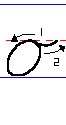
In this movement raise the elbow from the desk, and move the whole arm from the shoulder with the pen, letting the hand slide on the nails of the third and fourth fingers. This movement is only used in making large Capitals
Formation is the manner in which letters are made. All letters are formed with straight lines and curves called principles. The straight lines are all parallel and of the same slant. Curves are of three kinds, convex, concave, and compound
Slant
All straight lines in the formation of letters should be at an angle of fifty-three degrees (53 deg), and all curved lines in small letters connecting straight lines should be at an angle of thirty-two degrees (32 deg); when the space between letters is diminished this angle is increased, but in all cases the main slant should remain the same. The above engraving shows the MAIN SLANT (53 deg) and the CONNECTING SLANT (32 deg)
Space
The line on which the writing rests is called the BASE line, that at the head of the small letters the HEAD line; and the line to which the Capitals extend, the TOP line. A space in small letters is the width of the letter u and height of i, excepting the loop letters that have the height of capitals; d, p and t, that are two spaces above the base line; and f, g, j, p, q, y and z, that are two spaces below the base line
Shading
It is better that students in learning to write should make all small letters withoutshading except the letters d, p, and t; and in shading Capitals there should be but one shade in a single letter. After one has learned the formation of small letters, shading may be practiced, making two or three in a word of eight or nine letters
Cursive Letters: Analysis and Construction
With regards to cursive letters, nothing is of greater importance in learning to write than that the student should acquire a thorough knowledge of the analysis and construction of all the letters of the alphabet. Many persons fail to acquire a good handwriting, because they have never taken the trouble to inform themselves in this respect, and merely imitate the general characteristics of a letter without the slightest knowledge of its regular construction. Some individuals even boast of their ignorance, and pride themselves on the legibility or individuality of their style of writing. Educated people, however, consider a knowledge of the formation of letters essential to those who wish to acquire a graceful or genteel handwriting. After this has been accomplished, individuality will develop itself, and by constant practice you will gradually work out a peculiar style of your own; but without a knowledge of the fundamental laws of penmanship you can no more learn to write properly, than you could draw a fine picture unless you had first mastered certain rules relating to the art of drawing.
HOW SMALL CURSIVE LETTERS ARE FORMED
The three PRINCIPLES given below are those employed in the formation of all letters. They should be thoroughly understood before attempting to construct either small letters or capitals, as one, two, or all three of these principles are used in every case.
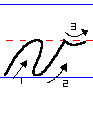
I. The first principle of small letters is a convex curve, commencing at base line, and ascending to head line at an angle of thirty-two degrees (32 deg).
II. The second principle is a concave curve, commencing at base line, and ascending to head line at an angle of thirty two degrees (32 deg).
III. The third principle is a straight line, commencing at head line and descending to base at an angle of fifty-three degrees (53 deg).
Begin on base line, and ascend with convex curve to head line; retrace one-half space, and finish the movement with convex curve to base line; turn to the right and ascend with concave curve to head line, forming a pointed oval; descend with a straight line on main slant to base; turn to right, and finish with concave curve. -- PRINCIPLES 1, 2 and 3.
Begin on base line, and ascend with convex curve to top line; turn to the left, and descend with straight line to base, crossing upward movement at head line; turn to the right on base line, and ascend with concave curve to head line; finish with a horizontal concave curve to the right, one-half space in length.--PRINCIPLES 2 and 3.
Begin on base line, and ascend with concave curve, leaving space enough between its highest point and the head line for the passage of another curve; unite angularly, and descend with straight line on main slant one-fourth space; make a short turn to the right, and ascend with concave curve; turn to the left over the upward curve, touching the head line; descend to base with straight line on main slant, and finish as in a.--PRINCIPLES 2 and 3.
Form the pointed oval as in a; continue the second principle one space above the head line; retrace to head line, and continue with straight line to base; turn to the right, and finish as in a; shade at top above the head line.--PRINCIPLES 1, 2 and 3.
Begin on base line with concave curve, and ascend to head line; make a turn to the left and descend with a straight line on main slant to base; turn to the right, and finish as in a.--PRINCIPLES 2 and 3.
Begin as in h with the upward and downward movement, crossing at head line; continue the straight line two spaces below the base; turn to the right, and ascend with concave curve, touching straight line at base; unite angularly, and finish with the concave curve to the right.--PRINCIPLES 2 and 3.
First, second and third movement same as in a; uniting angularly with a straight line on main slant, and finishing as in j.--PRINCIPLES 1, 2 and 3.
Begin on base line, and ascend with concave curve three spaces; turn to the left, and descend with straight line to base, crossing curve at head line; unite angularly, and ascend with convex curve to head line; turn to the right, and descend with a straight line on main slant to base; finish as in a.--PRINCIPLES 1, 2 and 3.
Begin at base line; ascend with concave curve to head line; unite angularly, and descend with straight line on main slant to base; finish same as in a; dot one space above third principle, on same slant.--PRINCIPLES 2 and 3.
Begin as in i; continue straight line on main slant two spaces below the base line, and finish as in g.--PRINCIPLES 1, 2 and 3.
Form loop as in h; ascend with convex curve one and one-fourth spaces above base line; turn short, and move toward the left with a concave curve; form loop on first principle at the head line, and finish as in i.--PRINCIPLES 1, 2 and 3.
Commence with convex curve; ascend two spaces; form loop as in h; turn short to the right, and finish as in i.--PRINCIPLES 2 and 3.
Begin with convex curve on base line; ascend to head line; turn, and descend with straight line on main slant to base; unite angularly; ascend to head line, repeating the above, and finish as in i. Width of m, two spaces.--PRINCIPLES 1, 2 and 3.
Commence and finish same as m. Width, one space.--PRINCIPLES 1, 2 and 3.
Begin on base line, and ascend with concave curve to head line; unite angularly, and descend with convex curve to base; turn short, and ascend with concave curve, forming an oval; finish with horizontal concave curve. Width of o, one-half space.--PRINCIPLES 1 and 2.
Begin on base line, and ascend with concave curve two spaces; unite angularly, and descend with straight line on main slant two spaces below base line; retrace to base line; complete us in n; shade below the base.--PRINCIPLES 1, 2 and 3.
Form pointed oval as in a; unite angularly, and descend with straight line on main slant two spaces below base line; turn short to the right, and ascend with convex curve to head line.--PRINCIPLES 1, 2 and 3.
Begin on base line, and ascend with concave curve one and one-fourth spaces; descend with a vertical curve to head line; turn short, and descend with a vertical curve to head line; turn short, and descend with straight line to base; turn short to the right, and finish same as i. Width, one-half space.--PRINCIPLES 2 and 3.
First movement as in r; descend with concave curve on main slant to base line; turn to the left, terminating with a dot on first curve, one-third space from base; retrace to base line, and finish with concave curve. Width, one-half space.--PRINCIPLE 2.
Begin on base line, and ascend with concave curve two spaces; descend with straight line to base; turn to the right, and end as in i. Shade above head line; cross with a straight line horizontally one-half space from top.--PRINCIPLES 2 and 3.
Commence with concave curve, ascending to head line; unite angularly with straight line on main slant, and descend to base; turn, repeat the same thing, and finish as in i. Width, one space.--PRINCIPLES 2 and 3.
Begin at base line, and ascend with convex curve to head line; turn to the right, and descend with straight line on main slant to base; turn to the right, and ascend with concave curve to head line one-half space from top of second movement, and finish with a horizontal curve to the right. Width of letter, one-half space.--PRINCIPLES 1, 2 and 3.
The first two movements are the same as in n; turn to the right, and ascend with concave curve to head line; unite angularly, with a straight line on main slant, and finish with the last movement of v. Width, one and one-half spaces.--PRINCIPLES 1, 2 and 3.
First two movements same as in n; the third movement begins at the head line, and, descending, traces the second movement one-third of its length; continue to the base line; turn to the right, and finish with the concave curve.--PRINCIPLES 1, 2 and 3.
Begin on base line, and ascend with convex curve to head line; turn, and descend with a straight line on main slant to base; turn to the right, and ascend with concave curve to head line; unite angularly with a straight line on main slant, and finish as in j.--PRINCIPLES 1, 2 and 3.
Three first movements as in r; unite angularly with a convex curve; ascend slightly, then turn to the right, and descend with a concave curve two spaces below base line; turn to the left, and finish as in j.--PRINCIPLES 1, 2 and 3.
CONSTRUCTION OF CAPITALS
We first present the three principles of the capitals, which a student should practice before writing the letters. They are formed by the convex and concave curve, which are the first and second principles of writing.
Capital Stem. -- Formed with principles 1 and 2. Height, three spaces; finished with an oval one-half its height.
The Oval. -- Formed with principles 1 and 2. Height, three spaces. Width, one-half its height.
The Inverted Oval.--Formed with principles 1 and 2. Begin one and one-half spaces from base line, ascend to top line, making an oval two-thirds its height. With this principle the letters Q, U, V, W, X, Y and Z are made.
Begin with capital stem; from its top descend with a straight line on main slant to base line; begin a slight curve to the left on the straight line, one and one-fourth spaces from base line, and descend one-half space; cross straight line, and ascend with a concave curve to head line. Commence shade on the stem, one-fourth space above head line, and finish on base line. PRINCIPLES 1, 2 and 3.
Begin two and one-half spaces from base line, and descend with capital stem on main slant; make an oval turn to the left, and ascend to top line; make an oval turn to the right, and descend to one and one-half spaces from base line; cross the capital stem, and form a loop pointing upward; then descend with a right curve to base line; turn, and ascend one space. PRINCIPLES 1 and 2.
Begin on base line and ascend to top line with concave curve; turn to left, and descend to base line, forming loop as in l; finish with oval one-half the full height. PRINCIPLES 1, 2 and 3.
Begin two and one-fourth spaces from base line, and descend with compound curve to base line; form a horizontal loop, and touch the base at the right of crossing; ascend with convex curve to head line, crossing compound curve two spaces from base line; finish with oval extending downward two and one-half spaces from head line. PRINCIPLES 1 and 2.
Begin near the top line; after forming a small oval, descend one space from top line; form a small loop pointing downward, and finish with an oval two spaces touching the base. PRINCIPLES 1 and 2.
Begin F with convex curve (same as small letter n) one-half space from top line; ascend to top line; turn to the right, and descend with a straight line one-third of a space; form a horizontal compound curve to the right, one space; form loop pointing upward at top line, and descend with capital stem same as in the capital letter A; cross capital stem one and one-half spaces from base line. The capital T is formed in the same manner as F, without the crossing on the stem. PRINCIPLES 1 and 2.
Begin as in small letter l; after forming loop, make an oval turn, which should be three-fourths of a space from base line; ascend to a point one and one-half spaces from base line; unite angularly, and finish with lower part of capital stem. Position of loop should be such that a straight line, drawn from its top to the centre of oval of the stem on base line, would be on main slant. PRINCIPLES 1 and 2.
Begin on base line, and ascend with concave curve three spaces; unite angularly, and complete with capital stem; begin second part at top line, one space to the right of stem; descend to base line with a slight convex curve; finish as in A. PRINCIPLES 1 and 2.
Begin I one space from base line, and ascend one-half space with convex curve; carry it well toward the right, and form a broad loop pointing downward one space from base line; ascend with convex curve to top line on main slant; make a short turn, and finish with capital stem, passing downward through the centre of loop. PRINCIPLES 1 and 2. Capital J.--Begin as in I; after passing through the loop, descend with a straight line on main slant two spaces below the base line; make a left turn, and ascend with a convex curve, crossing downward movement at base line and ending one space above. PRINCIPLES 1, 2 and 3.
Form the first part as in H; begin second section at a point on top line one space to the right of stem, and descend with a compound curve one space from top line; form a loop across capital stem, pointing upward; descend with a straight line on main slant to base line, turning to the right; finish with concave curve. PRINCIPLES 1, 2 and 3.
Ascend from base line with the concave curve to top line; turn short to the left, and descend with capital stem to base line, crossing the concave curve: one and one half spaces from base line; form horizontal loop touching base line to the right of crossing; finish with concave curve. PRINCIPLES 1 and 2.
Begin as in A with capitalstem; begin second downward movement at top line connecting with top of capital stem; descend to base in a straight line, touching one space from the point on base line touched by oval of capital stem; from base line ascend with concave curve to top line to a point one space to the right of capital stem; unite angularly, and descend with concave curve to base line; finish with an oval one and one half spaces from base line. PRINCIPLES 1, 2 and 3.
Begin with the capital stem; unite at top with a downward straight line as in A; finish with a short turn, and concave curve, one and one half spaces from base line. PRINCIPLES 1, 2 and 3.
Same as oval or second principle of capital letters. Width: one half its height. Last downward movement should be parallel to the first, and finish at one half space above base line. PRINCIPLES 1 and 2.
Begin with capital stem, and finish in the same manner as B, as far as the crossing loop. PRINCIPLES 1 and 2.
Begin with inverted oval, or third principle of capital letters; the oval should be two spaces from top line; form a horizontal loop on base line, touching the base at the right of crossing; finish with concave curve. PRINCIPLES 1 and 2.
Form R with capital stem the same as B, as far as crossing loop; descend to base with a straight line, touching one space from that point touched by the turn in stem; make a turn to the right, and finish with concave curve. PRINCIPLES 1, 2 and 3.
Begin at base line with the concave curve, and ascend to top line; make a turn as in L, and descend with convex curve: one and one half spaces from top line; cross upward curve, and finish with lower part of capital stem. PRINCIPLES 1 and 2.
[The letter T will be found in diagram with letter F.]
Begin with inverted oval (the third capital principle); oval should be two spaces from top line; make a turn on base line, and ascend with concave curve two and one half spaces; unite angularly, and descend with straight line to base; make a turn to the right, and finish with the concave curve. Width of U in centre one space. PRINCIPLES 1, 2 and 3.
Form V with inverted oval: same as U to base line; make a turn to the right, ascend with a concave curve two spaces, and finish with a short horizontal concave curve to the right. PRINCIPLES 1 and 2.
Commence with inverted oval, and continue to base line; unite angularly, and ascend with concave curve nearly three spaces; unite angularly, and descend with straight line to base, one space from first section; unite angularly, and ascend with convex curve one and one half spaces. PRINCIPLES 1, 2 and 3.
Commence with inverted oval, and continue to base line same as in W; begin second section at the top line, and with the convex curve descend, touching first section at the centre, or one and one half spaces above base line; make a broad turn to the right on base line, and finish with oval, which should be one and one half spaces in height. PRINCIPLES 1 and 2.
Commence, as in U, with the inverted oval; make a turn at base line, and ascend with the concave curve to top line; turn to the left as in l, and descend with a straight line two spaces below the base line; turn to the left, and with the convex curve ascend, crossing downward movement at base line; and finish same as in J. PRINCIPLES 1, 2 and 3.
Commence with inverted oval, and continue to base line, same as first section of X; form a loop pointing downward, and after crossing the downward movement, descend with concave curve two spaces below base line; and finish as in Y. PRINCIPLES 1 and 2.
Cursive Writing and The Art of Flourishing
Flourishing in cursive writing is the art of delineating figures by means of a rapid, whole-arm movement of the pen. This species of the penman's art has been practiced from time immemorial; not only as a distinctive feature of penmanship in the production of designs representing birds, animals, fishes, and fanciful designs, but also for the embellishment of writing and lettering. In former times, flourishing was of greater practical value and more highly esteemed than it is today
Before the discovery of printing, when the books of the world were written and illuminated by the pen, and during the centuries immediately following the discovery of printing, the art of flourishing was extensively practiced. It was greatly prized, and considered a valuable accomplishment for professional teachers of artistic pen-work
The exercise of the hand in flourishing tends to give ease and dexterity in the execution of practical writing. The plates connected with this subject present a series of exercises adapted for the practice of learners in this fascinating department of the penman's art
POSITIONS IN FLOURISHING
The first cut on this page represents the correct attitude of the body, as well as the position of the hand and pen, while in the act of flourishing
It will be observed that the hand and pen are reversed, so as to impart the shade to the upward or outward stroke of the pen, instead of the downward or inward stroke, as in the direct or ordinary position, while writing
Sit square at the desk, as close as is practicable without touching it, the left hand resting upon and holding the paper in the proper position, which must be always in harmony with the position of the hand and pen. The penholder is held between the thumb and first and forefingers, the thumb pressing upon the holder about two inches from the point of the pen. The first finger is bent at the centre joint, forming nearly a right angle, and is held considerably back of the second finger, which rests upon the under side of the holder, about midway between the thumb and the point of the pen. The third finger rests upon the fourth; the nail of the latter rests lightly upon the paper about one and a half inches from the pen, in a straight line from its point, parallel with the arm
Another position of the hands, which is used and advocated by some penmen and authors, is: rest the arm upon the ball of the hand instead of the finger nail. The latter method is preferable in the execution of work requiring large sweeps of the pen, as in the former the fingers are liable to strike into the ink lines and mar the work. In the ornamentation of lettering and the execution of small designs--in short, most kinds of off-hand pen-work--the position described in the previous paragraph is the best
The movement employed in all flourishing is that of the whole arm, which is obtained by raising the entire arm free from the table, resting the hand lightly upon the nail of the fourth finger, all motion of the arm being from the shoulder, which gives the greatest freedom and scope to the movements of the pen. This same movement is used in striking whole-arm capitals. What dancing is for imparting grace and case of movement to the body, flourishing is to one's handwriting Its practice is thus of double importance, as a discipline to the hand, and as a separate accomplishment
Material used with permission of Zaner-Bloser, Inc., Columbus, Ohio
ERIC Clearinghouse on Reading, English, and Communication Digest #124
Educators involved with young children who are just beginning to write have a very important job. As with all emerging skills, what is learned right from the start will shape lifelong habits and abilities. Writing is a skill used to express thoughts and communicate. A fundamental part of writing is the learning and forming of letters.
With the teaching of any skill there are choices to be made regarding the method(s) of instruction used. When teaching handwriting, is it better to teach using the vertical manuscript letterforms, such as the Zaner-Bloser method of handwriting, or is it better to use a slanted alphabet, such a D'Nealian. What ware the differences between the methods and how do those differences affect children who are learning to write?
How educators answer these questions and the course of action they take regarding handwriting instruction may, indeed, affect their students for life. So it would be wise for educators to think carefully, examine all their options, and be certain their choice of handwriting instruction is based upon the most current research (Dobbie & Askov, 1995)
Vertical vs. Slanted: A Historical Perspective
Manuscript writing was brought to the U.S. from England in the early 1920s by Marjorie Wise, a specialist in teaching handwriting. Manuscript caught on as an initial writing style because the letters are formed from simple strokes that are easy for young children to understand and write. The discussion of vertical vs. slanted handwriting instruction commenced in 1968, when the first slanted alphabet was created--the debate has been ongoing ever since.
Seen as a bridge between manuscript and cursive, the slanted alphabet uses unconnected letterforms like the traditional, vertical manuscript, but its letterforms are slanted like cursive. Thus, the slanted alphabet seems easier to write than cursive, yet is similar enough to cursive that children don't have to learn 2 completely different alphabets.
Using this logic, teaching a slanted alphabet to young students seems a good idea. However, after several years of use in some schools, research has found surprising answers to some key questions in the ongoing debate of vertical vs. slanted.
1. Which alphabet is developmentally appropriate?
Farris (1997) maintains, "By age 3, children produce drawings that are composed of the same basic lines that constitute manuscript letters: (1) vertical lines, (2) horizontal lines, (3) circles... Because of such early experience, most 6-and 7-year-olds can create these vertical and horizontal lines more easily than the relatively complicated connections associated with D'Nealian manuscript or cursive handwriting. Because vertical lines are made with a straight up-and-down motion and horizontal lines by a left-to-right motion, they rely predominantly on already acquired gross motor skills."
On the other hand, modified italic letters use very complicated strokes for young children. When examined closely, slanted letters are actually cursive letters without beginning and, in most cases, ending strokes. Graham (1992) states that "The writing hand has to change direction more often when writing the [slanted] alphabet, do more retracing of lines, and make more strokes that occur later in children's development."
2. Which Alphabet Is Easier to Write?
The popularity of the vertical manuscript alphabet is a direct result of its being an easily learned system that relates closely to initial learning. Because there are only 4 simple strokes that make up the vertical manuscript alphabet, writing the letterforms is quickly mastered by young children.
Slanted manuscript, however, was created to be similar to cursive. Because of this, children must learn 12 different strokes. Educational researchers who tested the legibility of slanted manuscript found that children writing vertical manuscript "performed significantly better" than those writing slanted manuscript. The writers of the slanted alphabet "produced more misshapen letters, were more likely to extend their strokes above and below the guidelines, and had greater difficulty maintaining consistency in letter size" (Graham, 1992(
3. Which Alphabet Is Easier to Read?
Vertical manuscript letterforms are more easily read than other styles of writing. This is why highway signs and other public signs are most often printed in vertical letter styles. Newspapers, novels, textbooks, computers, and television also make use of vertical manuscript letters because people must be able to read the messages quickly and without confusion. Indeed, advertisers and designers who use type for visual communication favor manuscript and avoid italic because italic is difficult to read. Wherever readability is important, manuscript letters are used.
Because italic writing is more difficult to read, it interferes with comprehension and speed. In a classic study, Tinker (1955) found that italic print was read 4.2% to 6.3% more slowly in 30 minutes of reading. This is why most literature, especially literature for beginning readers, is published using vertical type
4. Which Alphabet Is More Easily Integrated?
Handwriting is not an isolated part of the language arts. Young children who are learning to write are also learning to read and spell. Letter recognition is the first step, and when the letters children are learning to write are similar to those they use in reading and spelling, success in all 3 skills comes more easily. Kuhl and Dewitz (1994) state that "Since letter recognition is one of the most critical skills for early readers' success, having difficulty with this skill can have a damaging impact on early reading achievement."
Modified italic letterforms are not consistent with the letters used in reading and spelling books; therefore, children must learn to write using one set of symbols and to read and spell using a different set of symbols. Barbe and Johnson (1984) state that the introduction of a style of letters unlike the vertical print found in children's books is likely to confuse the child and may in fact hamper reading ability, especially when the unfamiliar symbols are introduced too early. Kuhl (1994) cites her own classroom experience: "As my kindergarten students began to learn the alphabet and learned to write [using a slanted D'Nealian manuscript adopted by the school], I noticed problems they had [when] learning to recognize letters. They consistently had difficulty identifying several letters, often making the same erroneous response to the same letter. As I recorded all responses in an attempt to analyze what they were doing, I began to notice patterns from child to child. D'Nealian manuscript appeared to be harder to learn."
Upon making this discovery, Kuhl and Dewitz (1994) went on to examine the research to find out why this confusion was happening. They found that letter symbols are learned upon repeated exposure to predictable, distinctive, and constant features. In other words, children experience success when learning to read and spell because the features (shape, angle, etc.) of the letters they are learning do not change significantly from one situation to the next. As children learn to write using the slanted D'Nealian manuscript, they are also reading traditional manuscript letterforms in books and environmental print. The difference in the letterforms between what they are learning to read and what they are learning to write is often substantial, causing great confusion for some children. Children who learn to write using vertical manuscript avoid this confusion. They are learning to read, write, and spell based on the same, constant model.
Hildreth (1963), in a study on early writing as an aid to reading, also pointed out the relationship of manuscript writing to beginning reading and suggested that these areas should not be separated but are in fact mutually reinforced. It is logical to teach children to write letters that are similar to the letters they are learning to read.
5. Which Alphabet Is Easier to Teach
Graham (1992) states: "Before starting school, many children learn how to write traditional [vertical] manuscript letters from their parents or preschool teachers. Learning a special alphabet such as [slanted] means that these children will have to relearn many of the letters they can already write." The vertical manuscript alphabet is easy to teach because there is no reteaching involved. Children are already familiar with vertical letterforms--they have learned them at home.
6. Does Slanted Manuscript Help with Students' Transition to Cursive?
Proponents of modified italic letterforms say that initial instruction in their alphabets will facilitate the transition from manuscript to cursive writing, but there is no research available to support this claim. In fact, in an extensive study of the available research, Graham (1992) finds no evidence substantiating claims that using a slanted manuscript alphabet enhances the transition to writing with cursive letters.
Conclusion
After examining the available research and answering the most common questions in the ongoing debate of vertical vs. slanted handwriting instruction, educators are left with one final question: Which alphabet will I teach my students? There are 2 choices: The vertical alphabet which, according to research, is more developmentally appropriate, easier to read, and easier to write for young children as well as being easier for educators to integrate and teach; or, the slanted alphabet, which was originally designed with the good intention of moving children more quickly and easily into cursive, but has been shown by research and experience to not only have fallen short of its original goal, but also to have created some problems for young children. The alphabet teachers choose should aid the teaching and learning process, not cause unnecessary difficulty, now or later. After all, in the final analysis there is one true measurement of whether a skill has been mastered or not--student success.
References
Barbe, Walter B. et al. (1983). "Manuscript Is the 'Write' Start" Academic Therapy, 18(4), 397- 405. [EJ 289 876]
Dobbie, Linda, and Eunice N. Askov (1995). "Progress of Handwriting Research in the 1980s and Future Prospects." Journal of Educational Research, 88(6), 339-51. [EJ 519 072]
Farris, P.J. (1997). Language Arts Process, Product, and Assessment (2nd edition). Madison, WI: Brown & Benchmark.
Graham, Steve (1992). "Issues in Handwriting Instruction. Focus on Exceptional Children, 25(2), 1-4. [EJ 455 780]
Hackney, Clinton S. (1991). Standard Manuscript or Modified Italic? A Critical Evaluation of Letter Forms for Initial Handwriting Instruction. Columbus, OH: Zaner-Bloser, Inc
Hildreth, G. (1963). "Early Writing as an Aid to Reading." Elementary English, 40, 15-2
Kuhl, D., and P. Dewitz (1994). "The Effect of Handwriting Style on Alphabet Recognition." Paper presented at the American Educational Research Association Meeting (New Orleans)
Tinker, M.A. (1955). "Prolonged Reading Tasks in Visual Research." Journal of Applied Psychology, 39, 444-445
Digest #124 is EDO-CS-97-05 and was published in June 1997 by the ERIC Clearinghouse on Reading, English and Communication, 2805 E 10th Street, Bloomington, IN 47408-2698, Telephone (812) 855-5847 or (800) 759-4723. ERIC Digests are in the public domain and may be freely reproduced. Additional copies may be ordered by contacting the ERIC Document Reproduction Service at (800) 443-3742.
This project has been funded at least in part with Federal funds from the U.S. Department of Education under contract number RR93002011. The content of this publication does not necessarily reflect the views or policies of the U.S. Department of Education nor does mention of trade names, commercial products, or organizations imply endorsement by the U.S. Government
The Clearinghouse on Reading, English, and Communication is an information repository of the Indiana University School of Education
Dr. Carl B. Smith, Professor
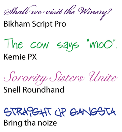
Before the invention of movable type systems, all text had to be carved, brushed, or written by hand. The downside to handwritten text -- especially my own -- is that achieving a uniformity of letterforms, alignment, and spacing can be frustrating. And as a result of these challenges, handwritten text can be very difficult to read. Yet the wonderful thing about handwriting is that it acts as a symbol of humanity, and gives a tangible personality to the text it represents. Just look at the text in Figure 4.18. Each line was written to represent the personality of the font in which it is written.
Handwritten fonts provide personality without the human error factor. The lettering and alignment in a handwritten font will be consistent, and if the font is well designed, the spacing should be good, too. As with any font, you cannot rely on site visitors to have your selected handwritten fonts installed, so to use them on the Web, you'll need to convert your handwritten text to images, or use some type of replacement technique, such as sIFR.
Here's a partial character map for february handwritten font. This is for quick reference only and may not constitute the entire character set provided in the font
When I see this font, I want to use it to write a lovely handwritten style invitation. Maybe a baby shower, or wedding shower. Ideas abound.
A lively, brush-style script font, named after a dear friend of the designer. Contains an alternate character for the lowercase 'r' as well special 'Th','Fl' and 'rr' ligatures.
I have aimed at putting together some information on handwriting analysis that will show you that much of it is common sense. What I claim, and it is confirmed by my own experiences and observations, is that knowing these basics and applying them every so often to better understand someone who I am dealing with has greatly enriched my life, made me more confident in dealing with others, and increased my understanding of my fellow man. I believe that if you apply these basics you will see the same results. That is why I have developed this website to assist you.
With Handwriting Insights you learn handwriting analysis by doing handwriting analysis, and you open the door to getting people to talk about themselves.
Anyone who has studied handwriting analysis can tell you that there is a lot to remember. I studied it for five years, taking four correspondence courses and reading dozens of books. It was an overwhelming amount of information. I created a 40-page spread-sheet to help me do analyses. Using this spread sheet by the time I finished analyzing the handwriting I no longer cared - it was just too much work. But if I didn't use it, I just couldn't remember what the different traits meant.
And so I just quit. Though I could see how useful handwriting analysis would be for me, and how people were always interested in my analyzing their handwriting, I was so frustrated by my long spreadsheet and my poor memory that I decided not to do it any more.
Then the most remarkable thing happened
At work one day (I did mediation) a person came in to see me (I'll call her Mary) to complain about her boss. At one point, she thrust down on my desk a document that had been signed by her boss and herself.
Mary's handwriting was large, bold, and flamboyant; it revealed someone who is not given to details (large size), has broad perspectives (large size), and has strong emotions (strong right slant). Her boss's writing revealed someone who was detail oriented (small size), regimented (rigid, overly straight baseline), and and used firm judgement (rigid). The two handwriting samples gave me a clue about how to approach the problem. I asked Mary if she had trouble with meeting schedules and I learned that indeed this was a source of contention between her and her boss. Mary felt that Darren micromanaged her.
Hmmmm, handwriting was sure helpful to me!
I became determined to find a simple way to analyze handwriting that did not require remembering so much information. After all, I didn't want to be a professional analyst. I just wanted to use it every now and then.
A core set of traits
Paula Sassi, a professional graphologist of 20+ years, and I developed a set of 11 handwriting traits, each trait having between three and ten variations. We put these together in a deck with a rivet at the corner, added a pad of paper where you could log the results, and the Handwriting Insights Kit was born.
*****
Are you wondering if you can learn something by looking at someone's handwriting? Lets take a look at a couple of writing samples from an old autograph book dating from the 1860's. It belonged to Lawrence, who was attending Bloomfield Academy.
The following entry was written by Bessie, a classmate of Laurence. It is reflective of the more elaborate formal writing of the time.
The last page of the book is autographed by Laurence's wife, Ann.
Does looking at Ann's handwriting raise questions in you mind? What is it about her handwriting that you notice? What picture of Ann is coming into your mind?
Let's see if we can agree on some things.
1. In 1868 Ann was probably either very young or had very little education
2. Bessie was probably older and had some formal education, as did Lawrence
3. You already do pay some attention to handwriting.
Even after people are departed from this world, their handwriting - their movement on paper - tells us about them
هم اکنون 1 کاربر در حال مشاهده این تاپیک میباشد. (0 کاربر عضو شده و 1 مهمان)
 قوانين ايجاد تاپيک در انجمن


 جواب بصورت نقل قول